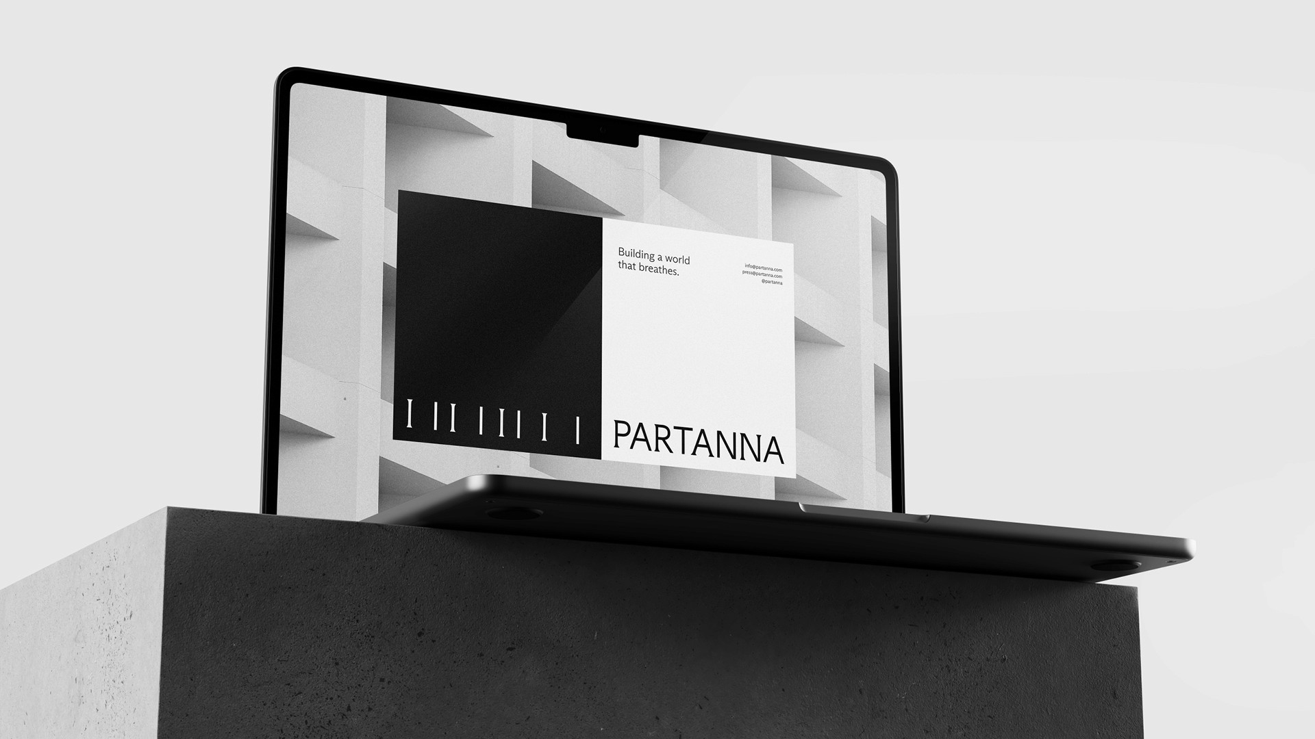
Building a world that breathes.
Building a world that breathes.
Building a world that breathes.
Partanna
Partanna
Partanna
Agency / Revolt
Agency / Revolt
Branding
The background
The background
The background
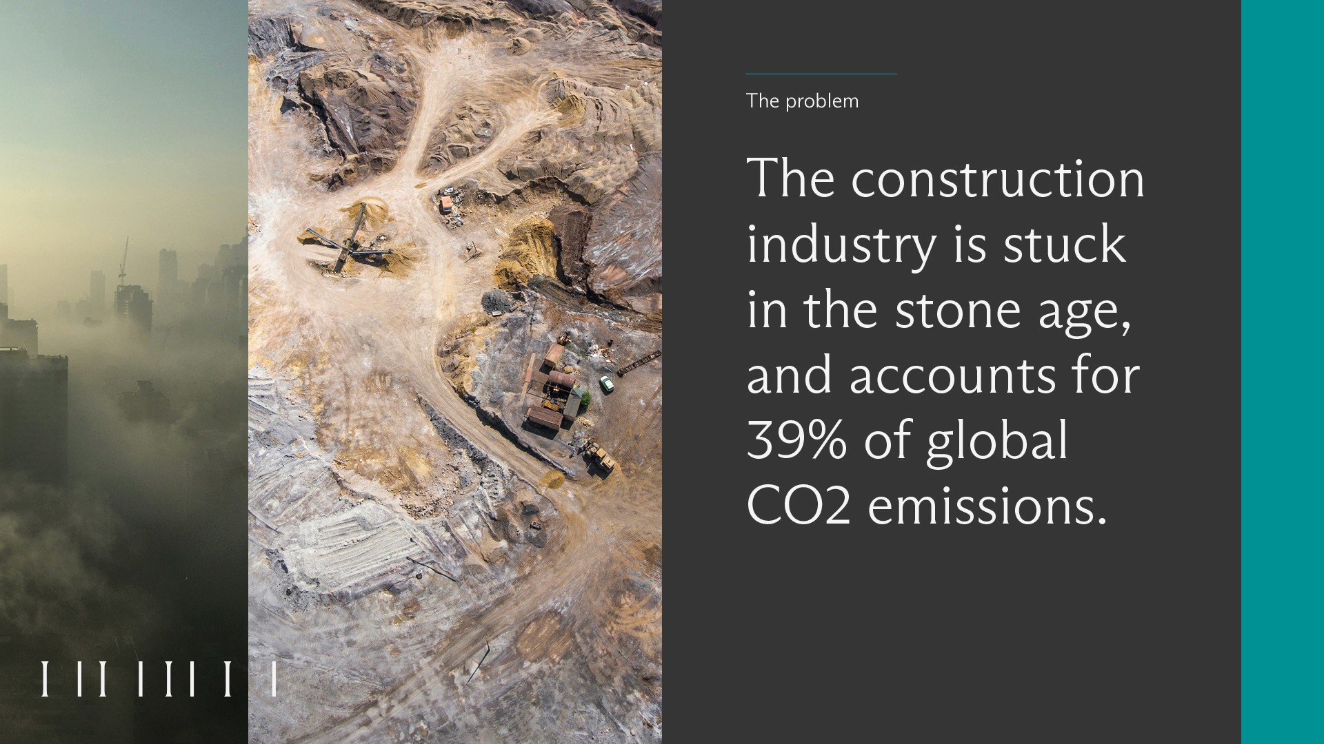
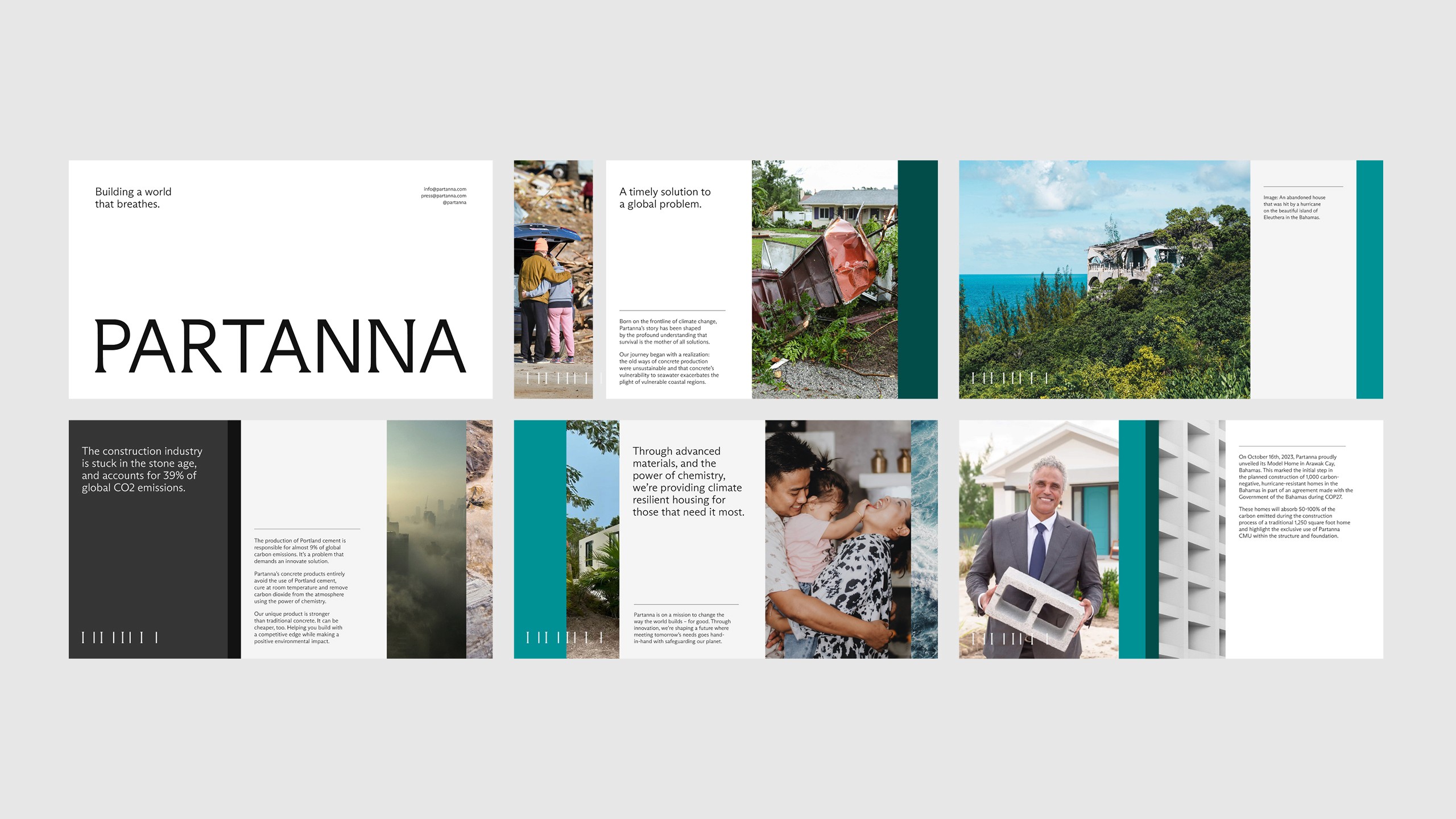
Partanna is a Bahamas based startup on a mission to change the way the world builds. They’ve developed a carbon-negative building material that is stronger than traditional cement, comparable in cost, and actually absorbs CO₂ from the atmosphere.
Mosa believe that cyclists have the power to transform cities into cleaner, greener, safer and healthier places – better for communities and better for the planet. Their smart docks are installed on existing bike racks and riders can use them for free via the app, providing secure parking and eliminating the need to carry heavy locks.
Partanna is a Bahamas based startup on a mission to change the way the world builds. They’ve developed a carbon-negative building material that is stronger than traditional cement, comparable in cost, and actually absorbs CO₂ from the atmosphere.
Partanna is made by upcycling brine and slag (byproducts from the desalination and steel industries that would otherwise be harmful in the environment). Remarkably, when these materials are mixed they produce compounds that absorb CO₂ like a tree. The resulting product is being used to provide climate resilient housing for those in coastal regions who are on the front lines in the fight against climate change. Partanna wanted an identity that felt progressive, design-led, and light – positioning them far away from the typically heavy and masculine brands normally found within the construction industry.
Partanna is made by upcycling brine and slag (byproducts from the desalination and steel industries that would otherwise be harmful in the environment). Remarkably, when these materials are mixed they produce compounds that absorb CO₂ like a tree. The resulting product is being used to provide climate resilient housing for those in coastal regions who are on the front lines in the fight against climate change. Partanna wanted an identity that felt progressive, design-led, and light – positioning them far away from the typically heavy and masculine brands normally found within the construction industry.
Partanna is made by upcycling brine and slag (byproducts from the desalination and steel industries that would otherwise be harmful in the environment). Remarkably, when these materials are mixed they produce compounds that absorb CO₂ like a tree. The resulting product is being used to provide climate resilient housing for those in coastal regions who are on the front lines in the fight against climate change. Partanna wanted an identity that felt progressive, design-led, and light – positioning them far away from the typically heavy and masculine brands normally found within the construction industry.




The visual identity
The visual identity
The visual identity
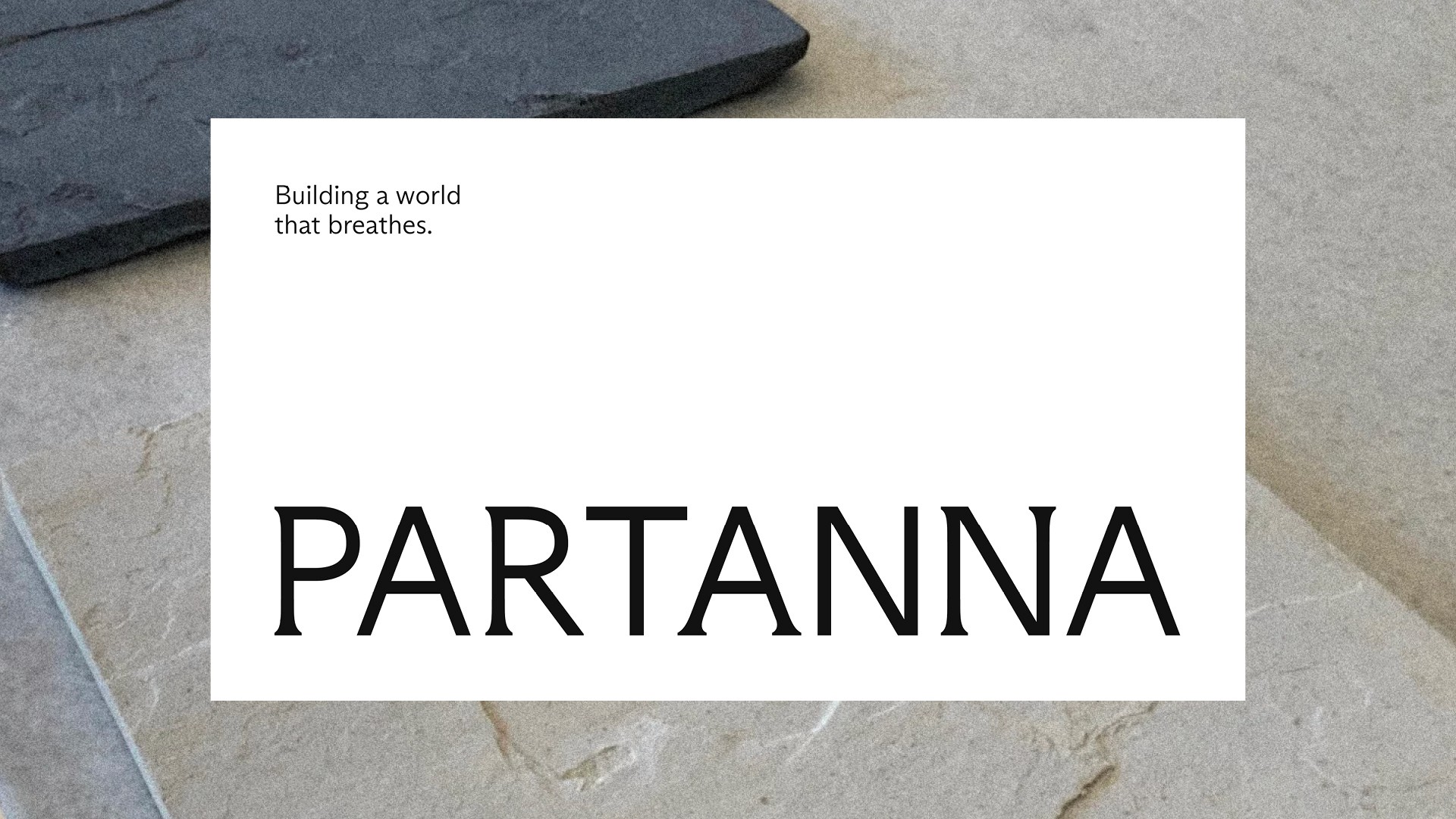
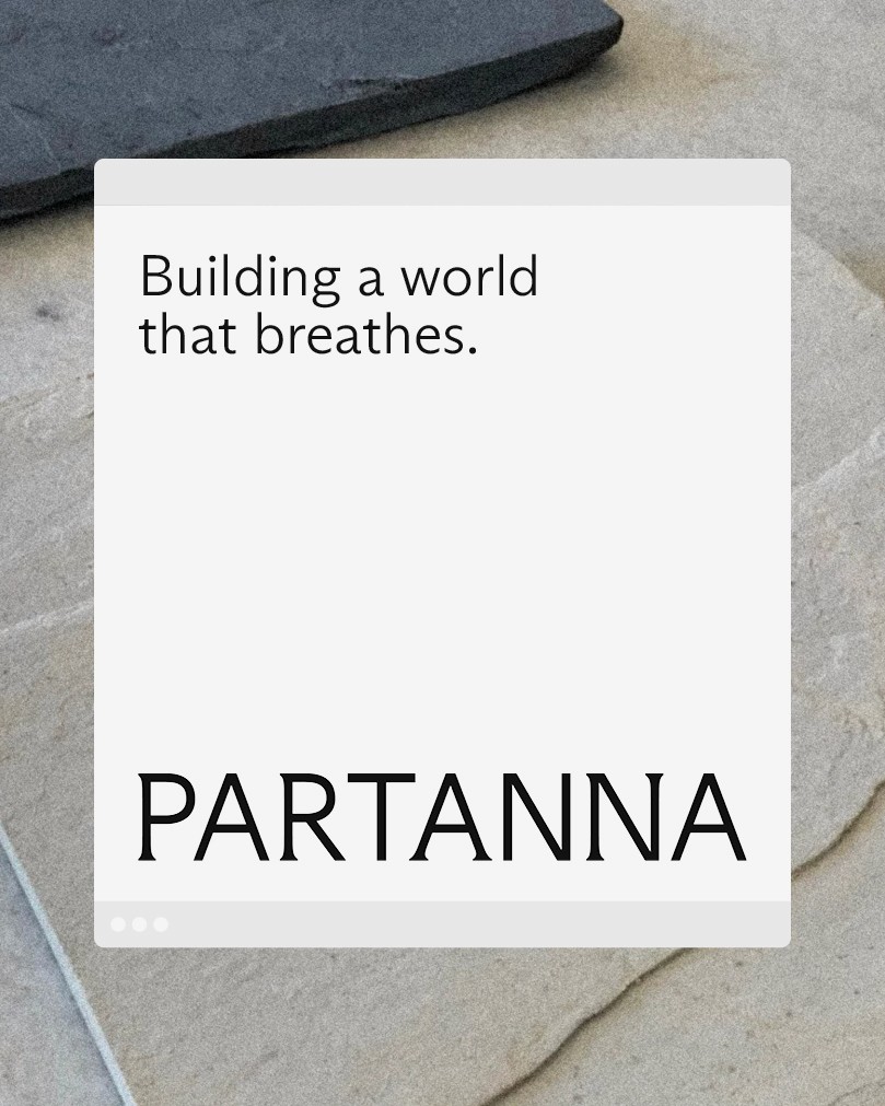
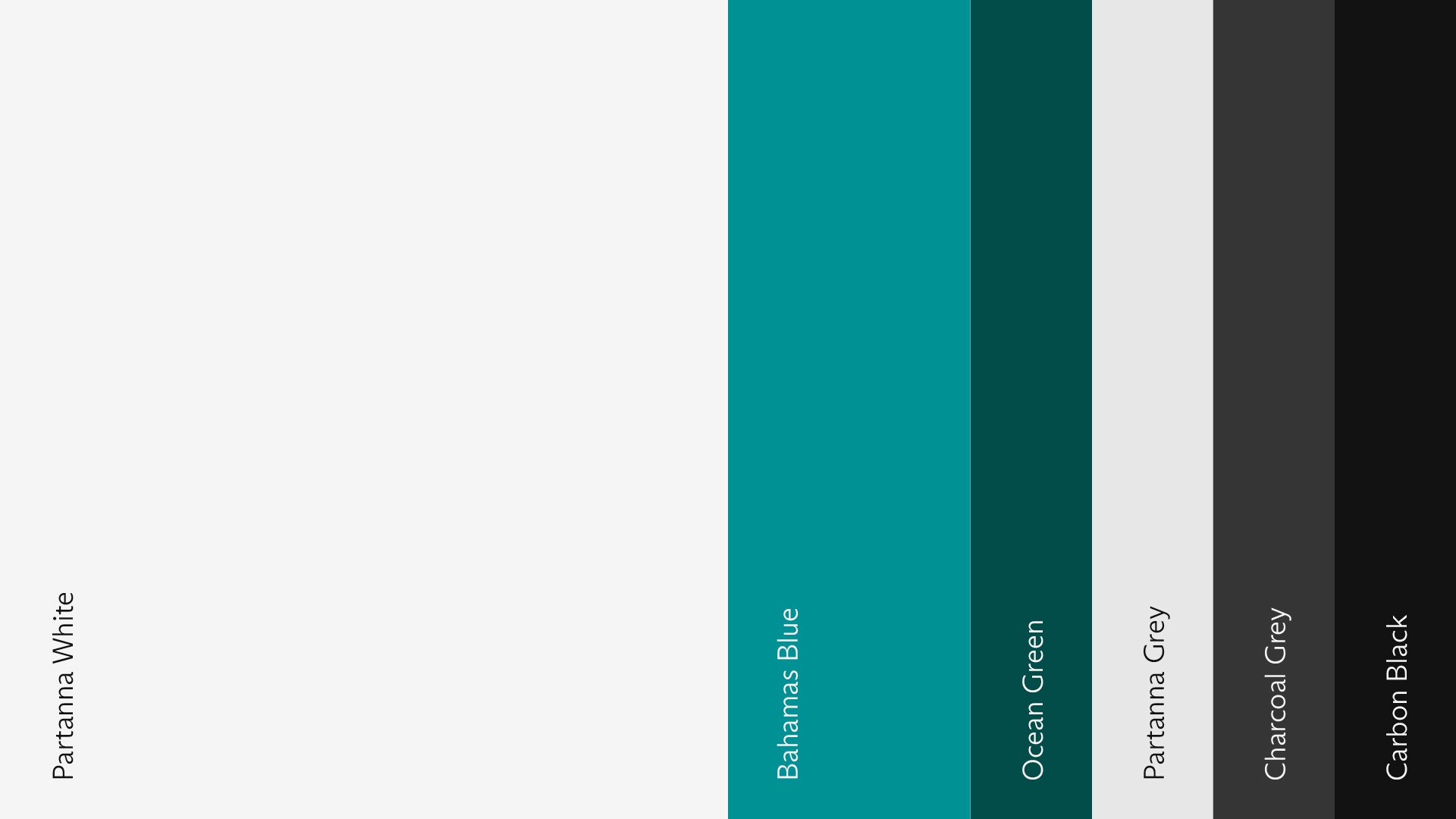
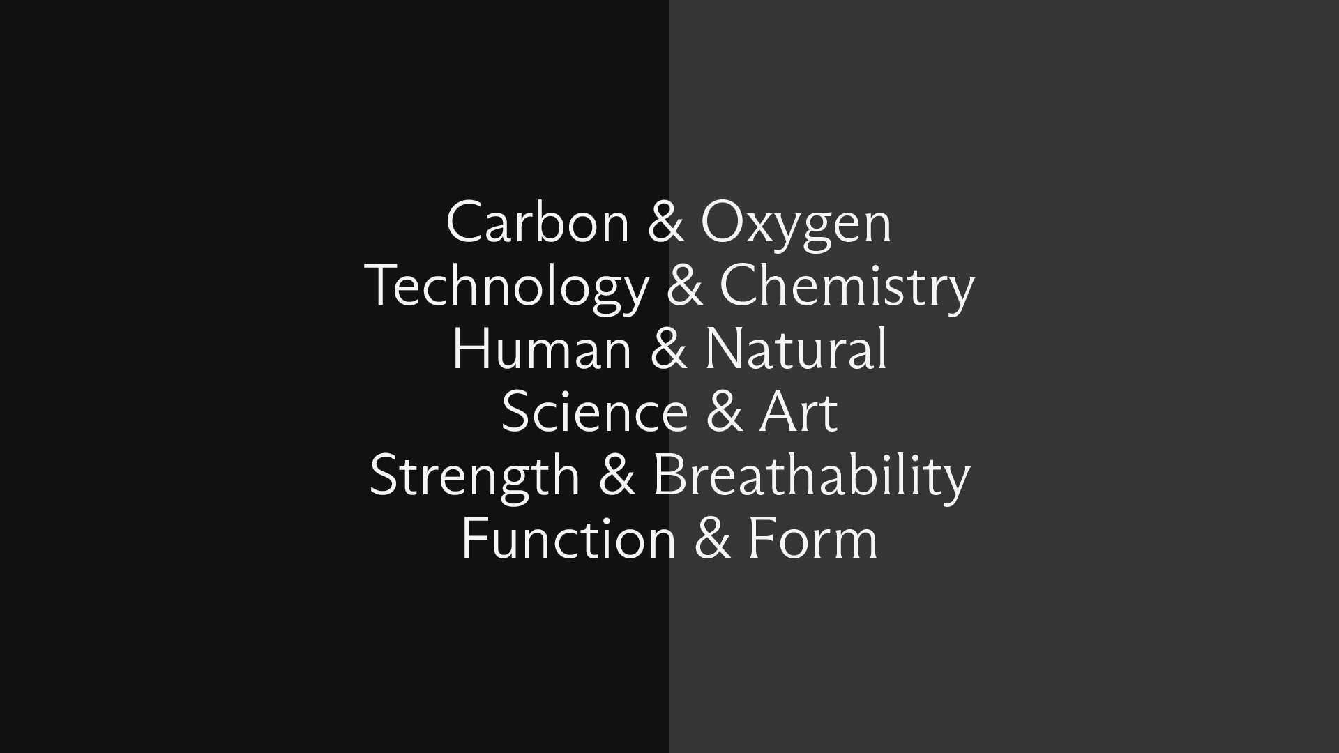
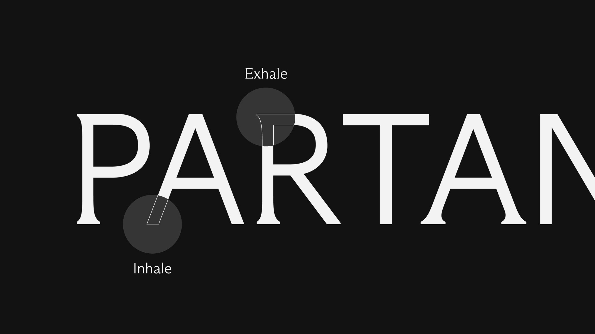
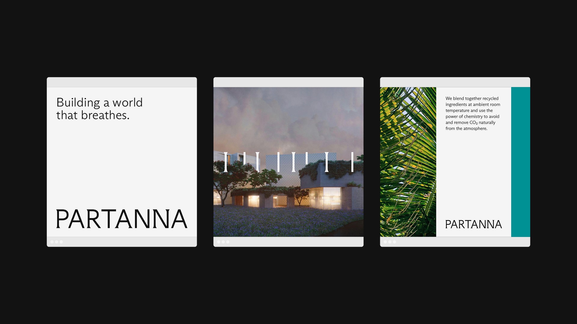
The brand idea for Partanna was ‘building a world that breathes', inspired by the unique qualities of the product and the bold vision of a future free from pollution. Partanna is where strength meets breathability, where technology meets chemistry, function meets form, and present meets future. This is reflected in a design system that showcases the power of duality and the beauty in two opposing states working together, just like the inhale and exhale of breath. The concept was brought to life through typography by using two fonts from the same family – Arizona Flare and Arizona Sans – to make it feel as if the logotype is breathing in and out. A simple black and white colour palette, accented by two tones of Bahamas blue, elevates the identity while vertical slices in layouts create a sense of structure and progress.
The brand idea for Partanna was ‘building a world that breathes', inspired by the unique qualities of the product and the bold vision of a future free from pollution. Partanna is where strength meets breathability, where technology meets chemistry, function meets form, and present meets future. This is reflected in a design system that showcases the power of duality and the beauty in two opposing states working together, just like the inhale and exhale of breath. The concept was brought to life through typography by using two fonts from the same family – Arizona Flare and Arizona Sans – to make it feel as if the logotype is breathing in and out. A simple black and white colour palette, accented by two tones of Bahamas blue, elevates the identity while vertical slices in layouts create a sense of structure and progress.
The brand idea for Partanna was ‘building a world that breathes', inspired by the unique qualities of the product and the bold vision of a future free from pollution. Partanna is where strength meets breathability, where technology meets chemistry, function meets form, and present meets future. This is reflected in a design system that showcases the power of duality and the beauty in two opposing states working together, just like the inhale and exhale of breath. The concept was brought to life through typography by using two fonts from the same family – Arizona Flare and Arizona Sans – to make it feel as if the logotype is breathing in and out. A simple black and white colour palette, accented by two tones of Bahamas blue, elevates the identity while vertical slices in layouts create a sense of structure and progress.
The brand idea for Partanna was ‘building a world that breathes', inspired by the unique qualities of the product and the bold vision of a future free from pollution. Partanna is where strength meets breathability, where technology meets chemistry, function meets form, and present meets future. This is reflected in a design system that showcases the power of duality and the beauty in two opposing states working together, just like the inhale and exhale of breath. The concept was brought to life through typography by using two fonts from the same family – Arizona Flare and Arizona Sans – to make it feel as if the logotype is breathing in and out. A simple black and white colour palette, accented by two tones of Bahamas blue, elevates the identity while vertical slices in layouts create a sense of structure and progress.


Creative team:
Design Direction: Myron Darlington
Strategy: Nick O'Quinn
Design: Rosanna Highton, Andy Jackson
Design Direction: Myron Darlington
Strategy: Nick O'Quinn
Design: Rosanna Highton, Andy Jackson
Design Direction: Myron Darlington
Strategy: Nick O'Quinn
Design: Rosanna Highton, Andy Jackson
Design Direction: Myron Darlington
Strategy: Nick O'Quinn
Design: Rosanna Highton, Andy Jackson
