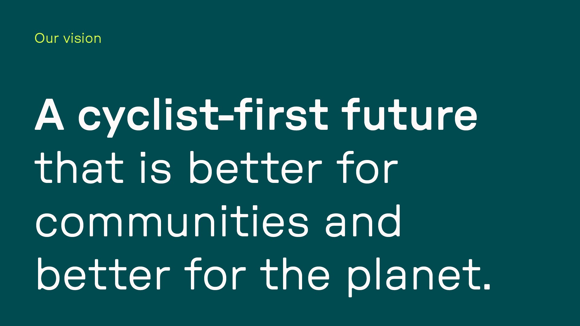
Securing a cycling-first future that is better for communities and better for the planet.
Securing a cycling-first future that is better for communities and better for the planet.
Securing a cycling-first future that is better for communities and better for the planet.
Mosa
Mosa
Mosa
Agency / Leap
Agency / Leap
Branding
Motion
Illustration
Branding Mosa
Branding Mosa
Branding Mosa
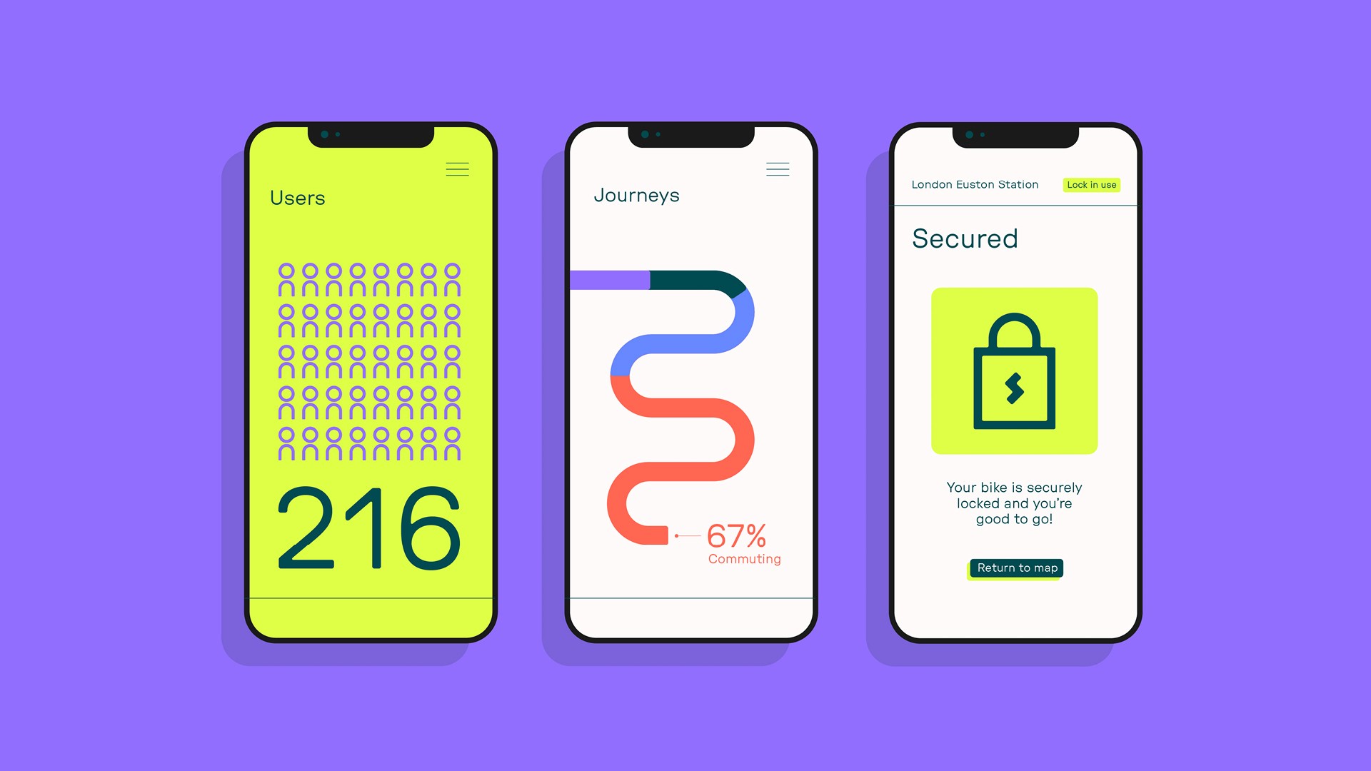
Mosa believe that cyclists have the power to transform cities into cleaner, greener, safer and healthier places – better for communities and better for the planet. Their smart docks are installed on existing bike racks and riders can use them for free via the app, providing secure parking and eliminating the need to carry heavy locks.
Mosa believe that cyclists have the power to transform cities into cleaner, greener, safer and healthier places – better for communities and better for the planet. Their smart docks are installed on existing bike racks and riders can use them for free via the app, providing secure parking and eliminating the need to carry heavy locks.
Mosa believe that cyclists have the power to transform cities into cleaner, greener, safer and healthier places – better for communities and better for the planet. Their smart docks are installed on existing bike racks and riders can use them for free via the app, providing secure parking and eliminating the need to carry heavy locks.
Mosa needed a bold identity that reflected their optimistic approach, flexible model and 'friendly disruptor' positioning. I was lead designer on the project, seeing it through from concept to delivery.
Mosa needed a bold identity that reflected their optimistic approach, flexible model and 'friendly disruptor' positioning. I was lead designer on the project, seeing it through from concept to delivery.
Mosa needed a bold identity that reflected their optimistic approach, flexible model and 'friendly disruptor' positioning. I was lead designer on the project, seeing it through from concept to delivery.





The visual identity
The visual identity
The visual identity
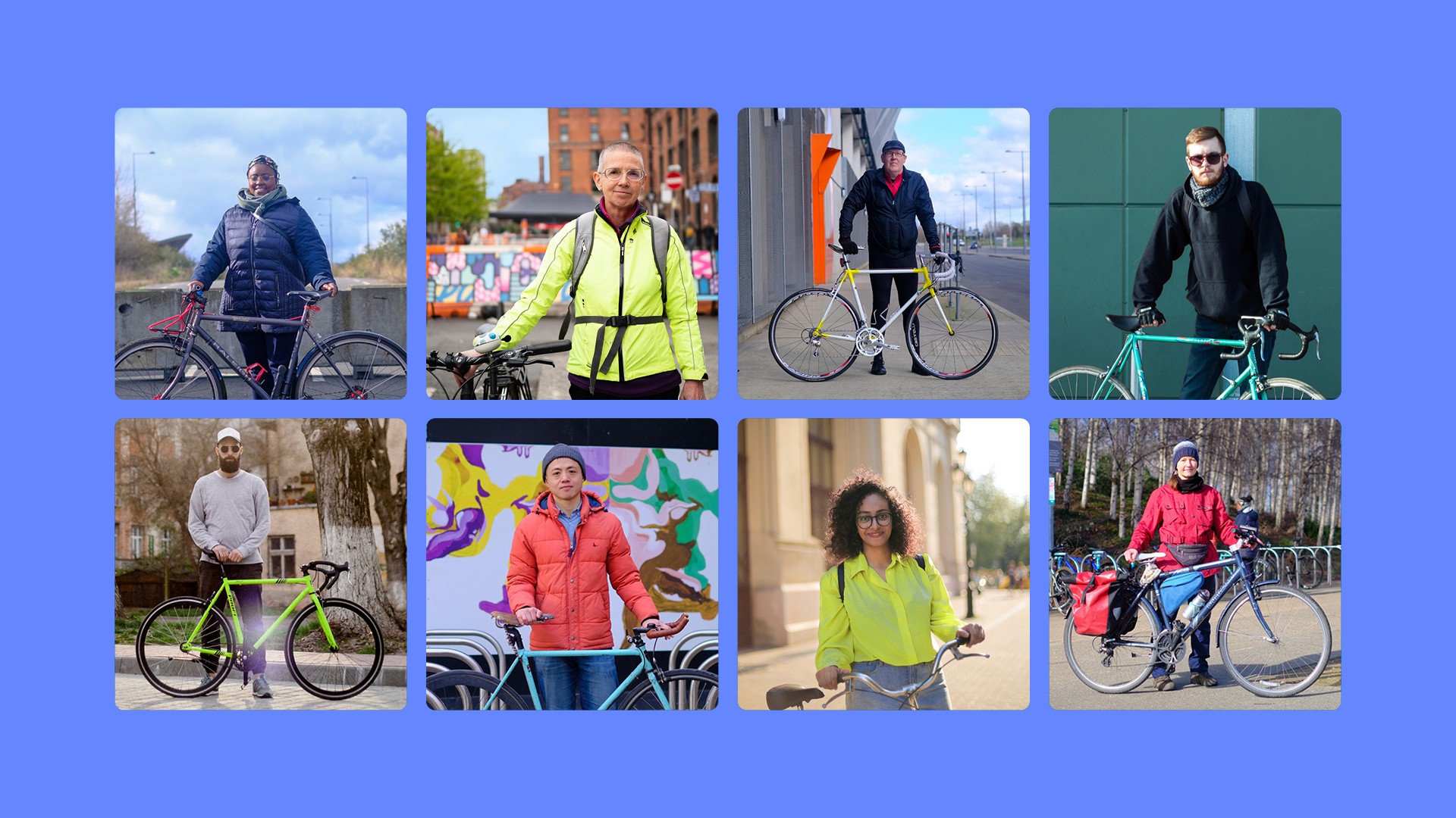
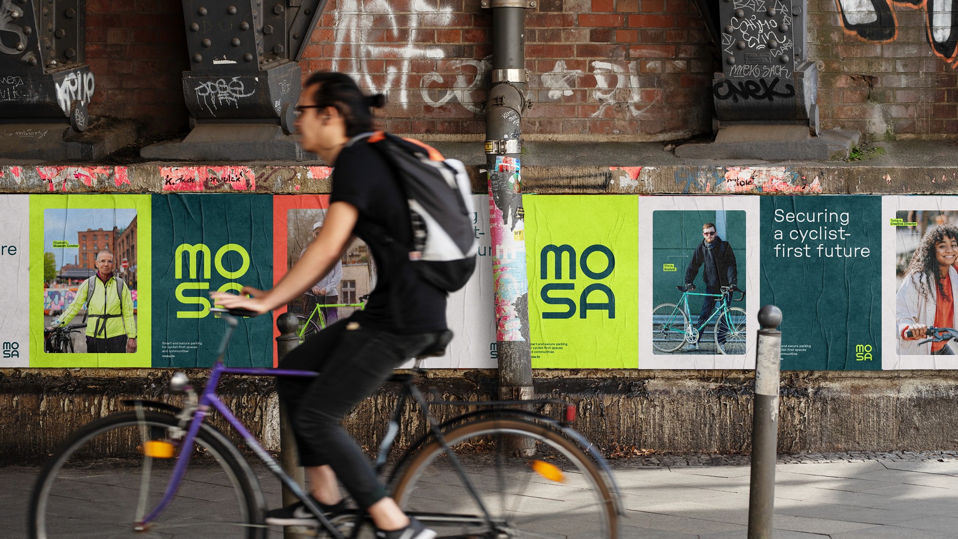
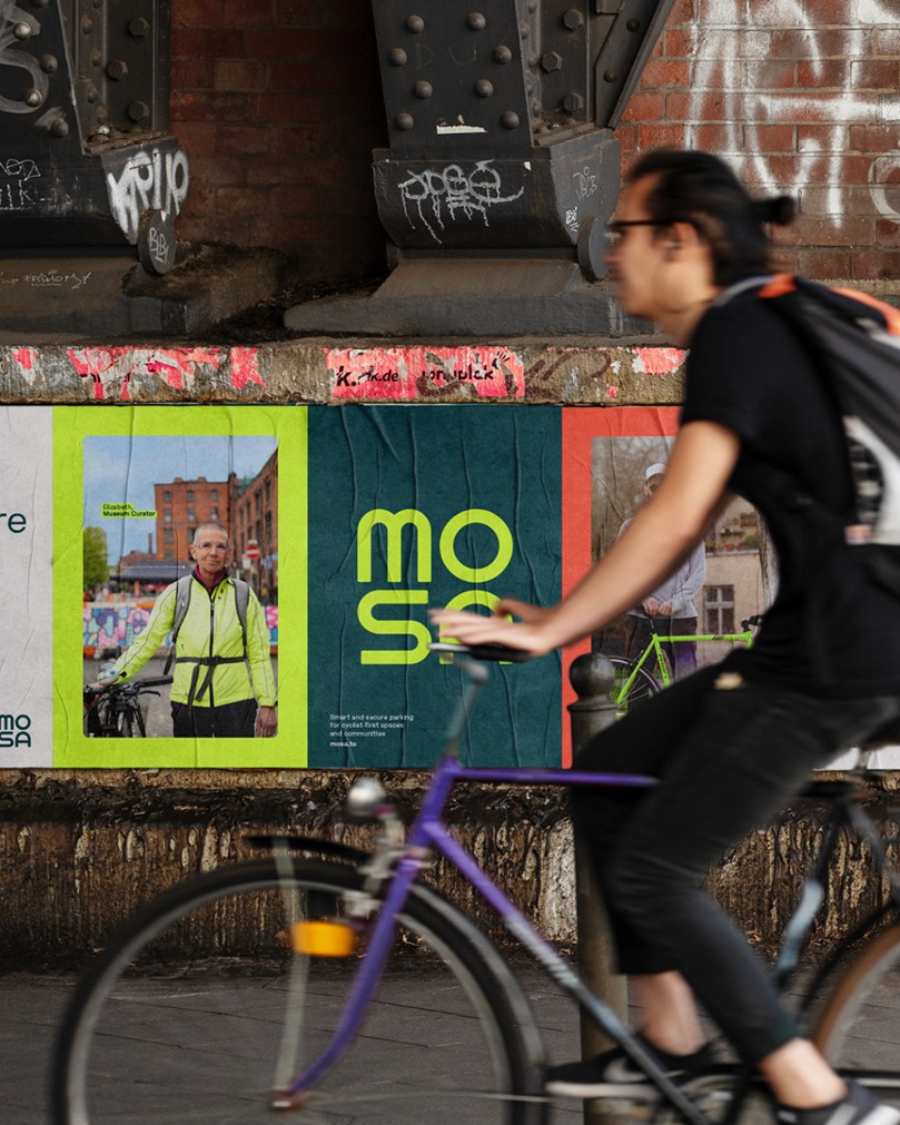
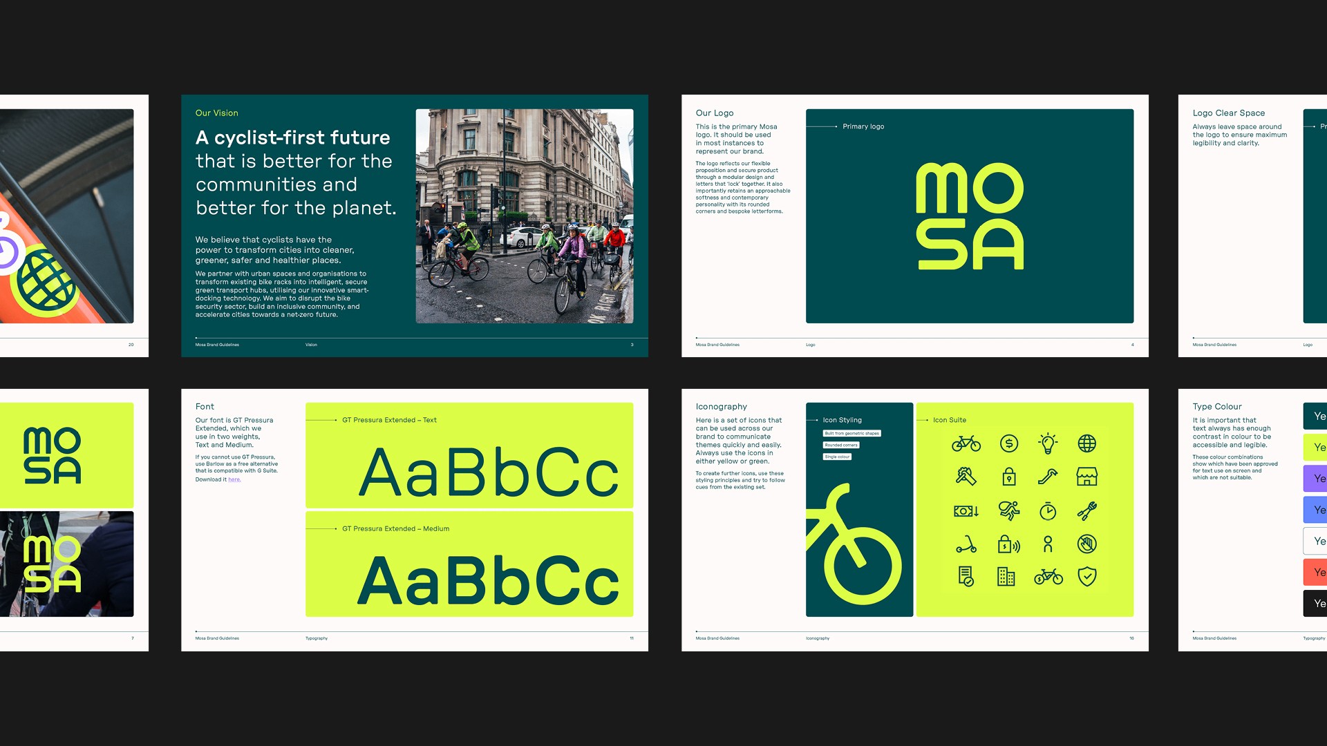
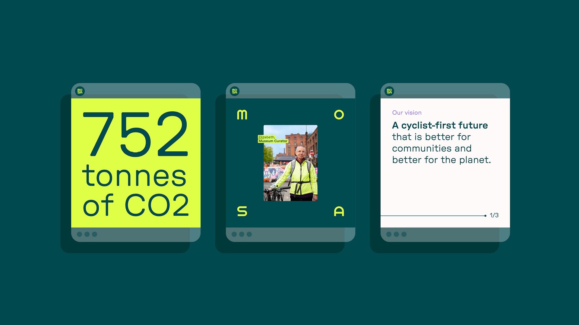
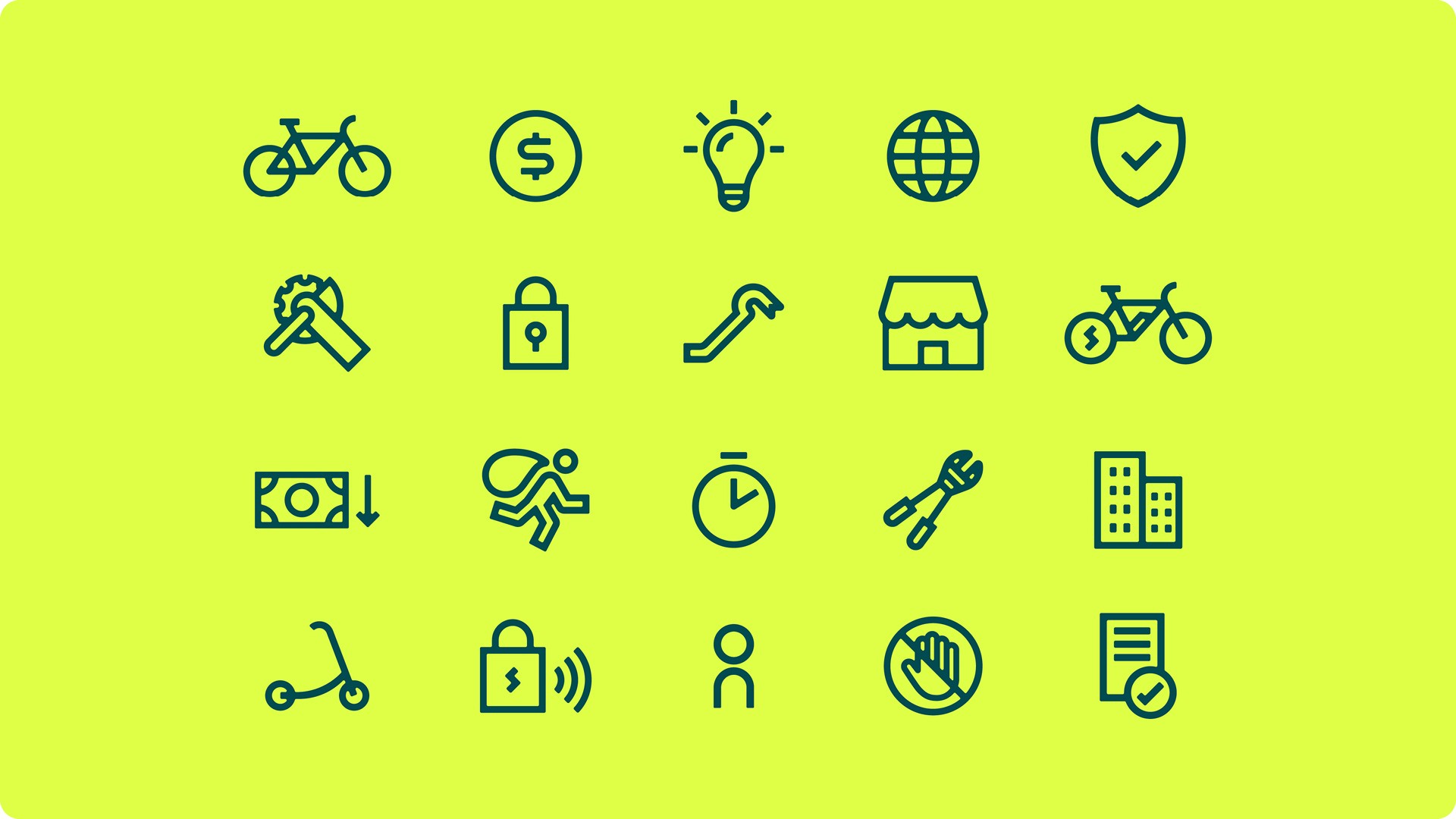
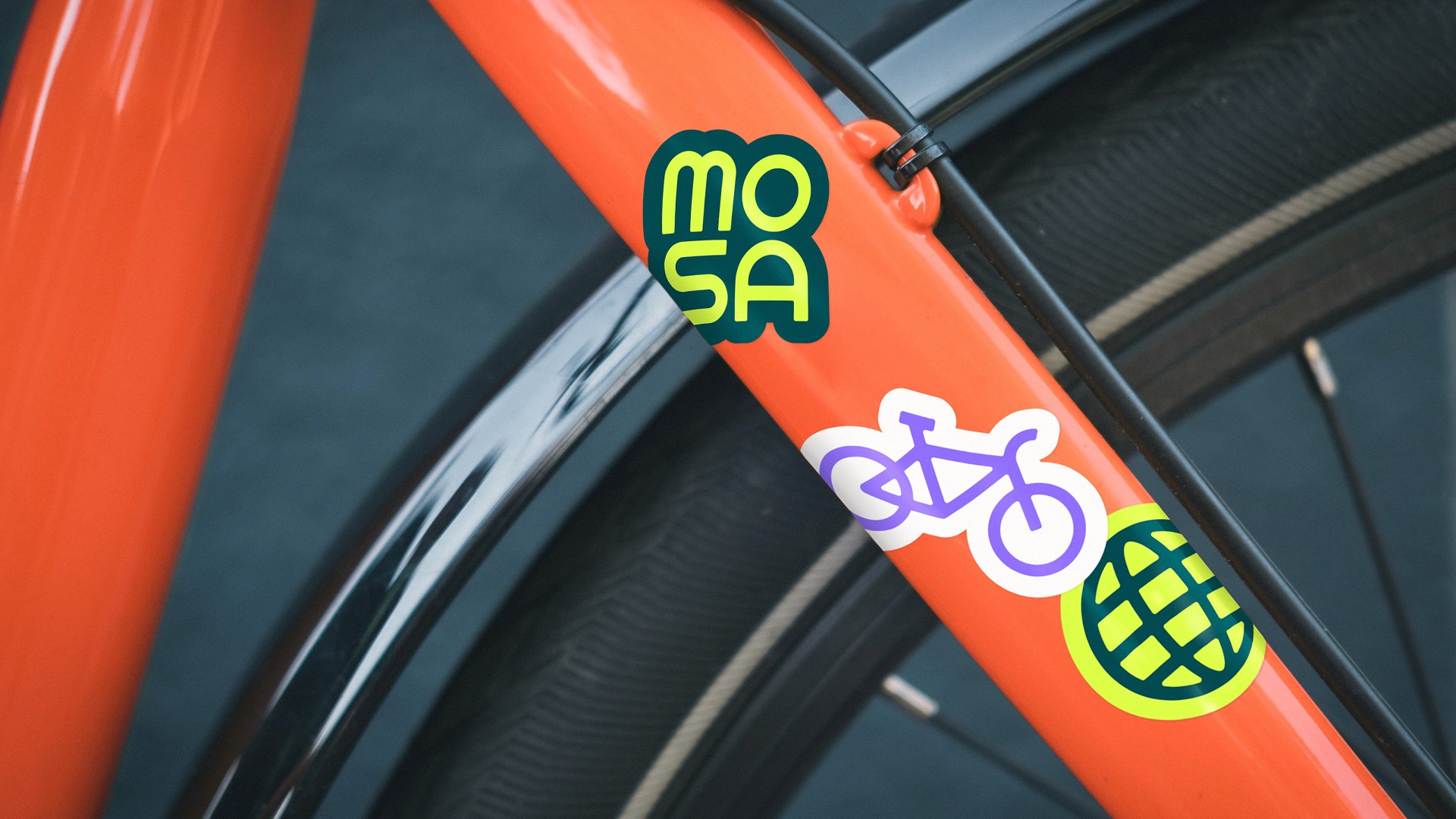
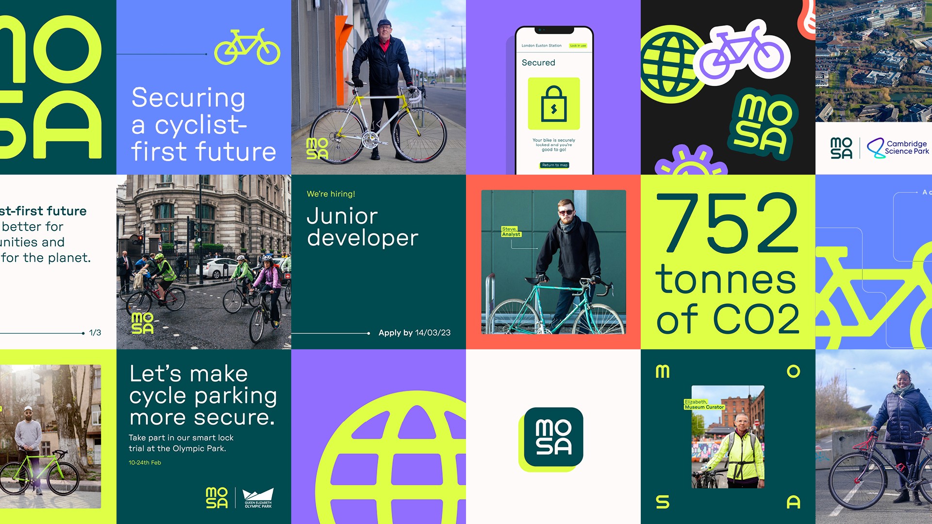
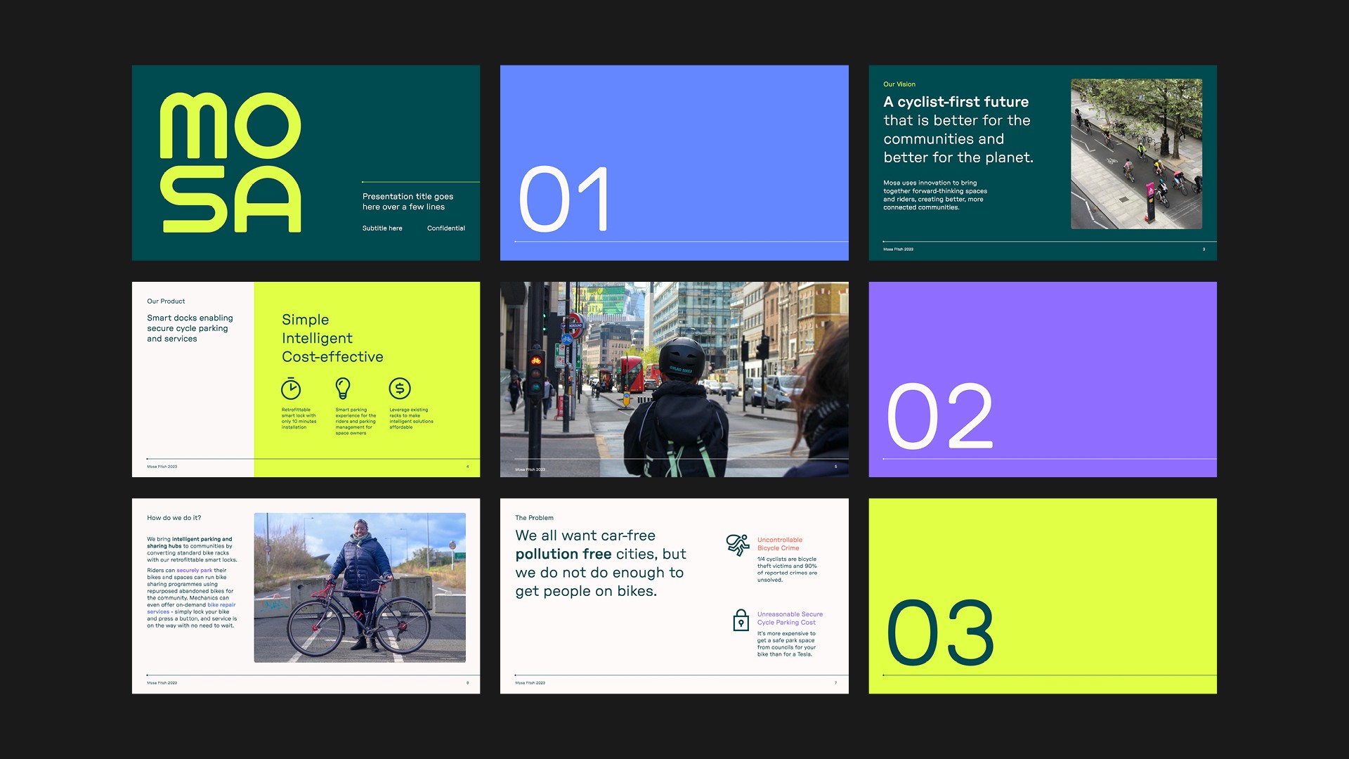
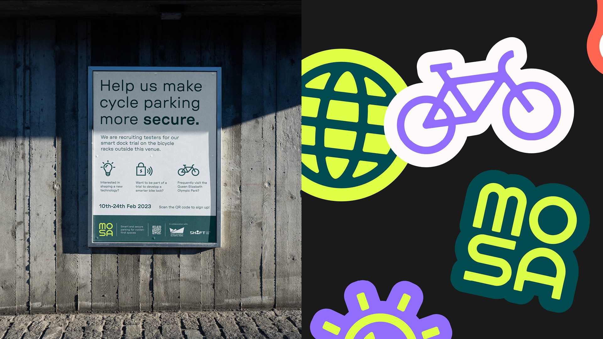
Urgent high-vis yellow, rounded icons and typography, and portrait photographs combine to create a brand that aims to disrupt the security sector, build an inclusive community, and help accelerate cities towards a net-zero future.
Urgent high-vis yellow, rounded icons and typography, and portrait photographs combine to create a brand that aims to disrupt the security sector, build an inclusive community, and help accelerate cities towards a net-zero future.
Urgent high-vis yellow, rounded icons and typography, and portrait photographs combine to create a brand that aims to disrupt the security sector, build an inclusive community, and help accelerate cities towards a net-zero future.
Urgent high-vis yellow, rounded icons and typography, and portrait photographs combine to create a brand that aims to disrupt the security sector, build an inclusive community, and help accelerate cities towards a net-zero future.




Creative team:
Creative Direction: Nathan Lance
Design: Rosanna Highton
Copywriting: Camilla Frankish
Creative Direction: Nathan Lance
Design: Rosanna Highton
Copywriting: Camilla Frankish
Creative Direction: Nathan Lance
Design: Rosanna Highton
Copywriting: Camilla Frankish
Creative Direction: Nathan Lance
Design: Rosanna Highton
Copywriting: Camilla Frankish
